Below are posters for movies I discovered in the book Attack of the 'B' Movie Posters. These posters have got it all: brazen compositions, political incorrectness, memorable titles (Invasion of the Blood Farmers), and amusing slogans ("So Young... So Bad... So What?"). The posters are likely better than the movies themselves, but it still makes me wonder why anyone would feel inclined to go see a movie with a title as bland as The Reader.
I was intrigued and impressed when I saw the cover of the Fiery Furnaces' recent live record, Remember (Thrill Jockey). At first glance, my eyes boggled and my mind knotted at the strange, perplexing shapes. And then it dawned on me that I was reading - or slowly deciphering - the word Remember. Someone has gone out on a limb with this one, and the result is a design that really surprises the viewer with its slow revelation.
Graphic design is about communication, and it's quite unusual for an album cover to abandon legibility and obscure communication the way that this one does. Of course, the title Remember is written legibly in the upper left hand corner of the square, but it's the larger, abstracted version of the word that dominates the composition. I love the way the E's and the M's interconnect with each other and I think the way the R has been simplified is quite brave. If I could change two things, I'd change the color of the first M (it appears to be negative space right now) and I'd include the last R in the composition (why has it been squeezed out of the frame?).
All in all though, this design is a risky one and it's nice to see a good, daring risk once in a while. I can't believe it got approved. One of my favorite quotes is from my former professor Sergio Baradat, who once said, "It's great to pull a rabbit out of your hat, but sometimes, a rabbit out of your hat is not what's called for." The cover design of Remember is an example of that first part - sometimes, it's great to pull a rabbit out of your hat.
Today I've selected ten art and design-related YouTube videos that I hope will inspire and entertain you. The subjects run the gamut from fine art and graphic design to graphic novelists, but they have one thing in common: serious ass-kickery. Enjoy.
Josef Albers: Homage to the Square
Here is a discussion of a painting (‘Aurora’) from Josef Albers’ ‘Homage to the Square’ series. I wish I could go back in time and take a class with the famed Bauhaus/Black Mountain master who believed that color was a “magic force.”
Paul Rand Interview
“Most good things have a timeless quality” according to designer Paul Rand, and this interview with him (on a hopelessly 80’s cable access program) is no exception. Rand is a hero of graphic design; his timeless work (logo designs for IBM, ABC, UPS) and no-nonsense, utilitarian approach to design can be seen here. Rand didn’t offer clients many choices for the solution to a logo design assignment “for the same reason that a doctor doesn’t give you a million choices – if you’ve got a headache, he’ll give you an aspirin. He doesn't give you a choice between that and Ex-Lax.” Visit YouTube to watch parts 2 and 3 of this interview with the coolest dude that ever did it.
Charles Burns in 'Fear(s) of the Dark'
This is artist Charles Burns’ entry in the animated French film ‘Peur(s) du Noir’ (‘Fears of the Dark’). Burns is responsible for Black Hole, the best graphic novel you’ll ever read. He uses his beautifully stark illustration style to tell Cronenberg-ian tales of love and lust that are dark, creepy, and usually populated with mutants. This film isn't available on DVD yet but this YouTube version will tide me over until it is. Visit YouTube for Part II.
Paula Scher: Great Design is Serious (Not Solemn)
Here is Pentagram partner Paula Scher’s speech ‘Great Design Is Serious (Not Solemn)’. Ms. Scher is refreshingly honest about the joys and disappointments of her career; she admits that some of her best work occurred in situations where she was “totally and completely unqualified for the job.”
Aesthetic Apparatus
The artists at the Milwaukee-based design studio Aesthetic Apparatus discuss their inspirations and processes. You know how every Criterion DVD release looks more beautiful than a cold beer on a hot day? These guys are one of the reasons why.
Jeff Koons Interview
Art is a “vehicle that creates anxiety.” Jeff Koons is interviewed here by the Tate Museum in his New York studio. If Warhol's studio was a factory, then Koons' place is an industrial complex. Out of all the museums whose YouTube channels I've browsed over the last week, the Tate's was the most watchable.
David Carson: Design, Discovery, and Humor
This is a quite funny and amusing speech given by David Carson, a graphic designer famous for breaking/ignoring a lot of rules in his work. “Don’t mistake legibility for communication,” he says here. “Just because something’s legible doesn’t mean it communicates; more importantly, it doesn’t mean it communicates the right thing.”
Matt Groening: 'My Wasted Life'
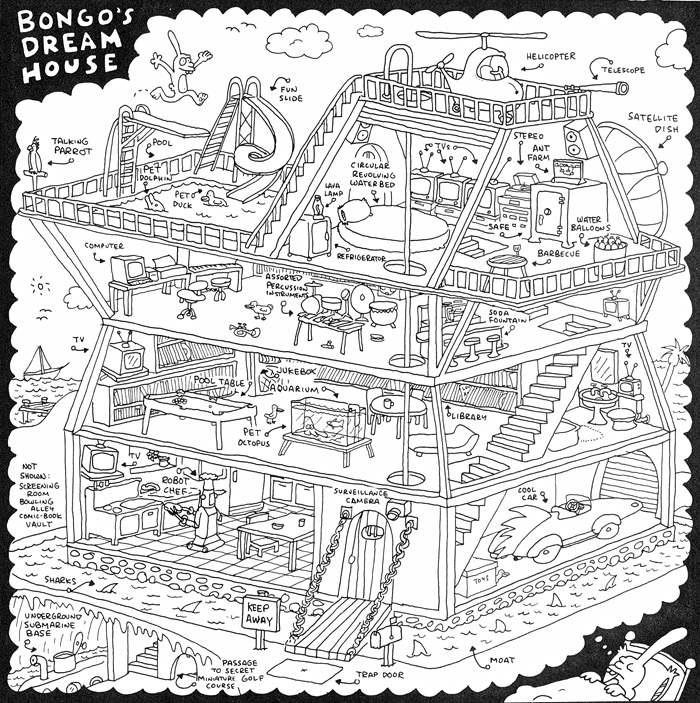
This is part one of a BBC program called ‘My Wasted Life’ about Simpsons creator Matt Groening. Groening recalls the sweet surreality of his own youth as well as the cultural roots of Bart and the gang. My favorite Groening comic: Bongo's Dream House.
Jenny Holzer: PROTECT PROTECT (Whitney Exhibit)
This video considers the politics of Jenny Holzer’s work on view in 'PROTECT PROTECT' at the Whitney Museum. Jenny Holzer has always been one of my favorites due to her skill at uniting image and word; the intersection of visual and literary arts has been a lifelong fascination for me. See the Whitney exhibit this week; its last day on view is Sunday, May 31st.
??????
Here is your new muse. Watch this video once a day and behold the wellspring of creativity that is sure to erupt from within your spirit.
This amusing set of 9 mock open/closed signs comes from the clever people at Aesthetic Apparatus (go here to see the other side of the signs). Not only are these folks charmingly self-effacing and clearly having lots of fun, but everything that comes out of their studio looks like a million bucks.
Thanks to Scott for the tip on this video about the font Comic Sans. Comic Sans is dopey for sure, but my personal most despised font is Sand, a typeface which wouldn't look out of place scrawled on the wall of a serial killer's crawlspace. Thanks to Drew for the tip on these satirical posters for Matthew McConaughey's Next 10 Movies (best one is 'Failure To Act'). And finally, thanks to Ryan for hipping me to this NYT article about J.J. Abrams' guest editorial issue of Wired magazine. I plan to pick the issue up tomorrow, and I also plan to be converted to an enormous Trekkie as soon as Abrams' revamp of the dorkiest film franchise ever hits theaters in early May.
I saw this image on a sticker for a local Brooklyn laborer's union (it's on the fridge in Carmine's pizzeria). The world would be a much cooler place to live if every time someone complained, they thought of this image, shut their trap, asked themselves "What would Eastwood do?" and then took care of business.
I am strongly considering plastering this image on the door of the studio just so people know where I stand on the issue of crybabies.
The movie posters for both Doubt and the new Sin Nombre combine two fonts in their logos: one blackletter-style font and one sans serif. The two fonts are so drastically different that the contrast is striking and the letterforms suggest a clash of the old and the new.
Sin Nombre (a new film already inspiring comparisons to City of God) uses Linotext for its blackletter-style font and Doubt (the kids just can't get enough of these brooding church dramas these days!) uses Goudy Text. These fonts are late-nineteenth/early-twentieth century updates of the blackletter font style that was popular from about 1150 to 1500. Linotext and Goudy Text add legibility to this antiquated style for modern audiences who don't normally sit down by the fireside to read a few passages from Gutenberg's 42 line Bible.
When I first saw the poster for Doubt, I was pleasantly surprised that a thoughtful graphic design treatment had been used, because most film posters are mere Photoshop Disasters. The difference between the two posters is that it's thematically powerful for Doubt to have a font with Biblical associations in its design (although I'd rather do math homework in the hottest layer of Hell than watch Meryl Streep scowl in a nun's habit for two hours). The application of the concept in Sin Nombre's design seems less relevant, although clearly sin is a theme in the film.
Anyways, I guess this isn't really a 'trend' yet; so far it's merely an incident of one designer ripping off the Doubt design. I'll be damned if there isn't more to come, though.
Here are my two favorite items I've come across while researching various projects this week.
According to heraldica.org, "the family of Coglione, in Naples, bore three pairs of testicles counterchanged" on their charge (the image on their shield). Ballsy! Why bother with the predictable rampant lion (I'll tell you about him next week) or three dexter arms conjoined at the shoulder when you can cut to the chase and tell your enemy what you really mean? I salute you, Coglione family, for your most heroic sense of humor. Unless those are actually reversed hearts.
You've probably seen this symbol around before; it is commonly known as the Hamsa and it seems to have corresponding mythologies in both the Judaic and Islamic cultures. In Islamic, it's called the 'Eye of Fatima' or the 'Hand of Fatima,' in reference to Fatima Zahra, the daughter of Muhammad. In Hebrew, it is the 'Hand of Miriam,' in reference to the sister of Moses and Aaron. In both cultures, it is meant to ward off evil, especially in the form of the 'evil eye' or 'stinkeye,' as I prefer to call it. Some evidence suggests that the Hamsa predates both religions, and some have used it to represent the common origins of Judaism and Islam. I've seen it described as having a thumb and pinky pointing outwards, but to me, that looks like a hand with two thumbs. Perhaps it originally signified two hands atop one another, in a spirit of offering or receiving? Or maybe, since this is sometimes referred to as the hand or eye of God, this represented God's hand? It would make sense if God had two thumbs on each hand, as the opposable thumb is a symbol of human evolution.
Even if you are not a graphic design geek, you must have noticed the disastrous redesign of the Pepsi logo recently! That's why I was happy to see that redesign in the 'Worst' category at the Best & Worst of 2008 list at Brand New, a knowledgeable blog about corporate branding and logo design that is actually fun to read. Also, Planet Earth was on during a dinner party I attended recently, and I couldn't help but implore some party guests to explain the meaning of the sideways 'M' in the bizarre new Animal Planet logo. Of course no one could explain that purposeless stunt in the logo, and so I was happy to see that in the 'Worst' category, too. Their best of the year honor goes to the mouth-wateringly cool designs at 826 Valencia.
"It's okay to pull a rabbit out of your hat, but sometimes, a rabbit out of a hat is not what's called for."-Sergio Baradat
DJ A-Trak has a blog and he is calling out suckas that perpetrate. He recently blogged about a flagrantly ripped-off Maroon 5 album cover design as well as another by Good Charlotte. Read/watch this post I wrote about A-Trak in June.
Today I updated a few things at www.magneticstate.com. New to the portfolio section is the logo I recently designed for D.C School Reform Now. This job was a real pleasure to work on and I believe that the ease of collaboration and communication between designer and client shows in the successful outcome! Thanks go to Alex and Andrew. Also new to the portfolio is the t-shirt design I submitted to the band Cut Copy (thanks, Riss!). So take your eyeballs for a stroll on over yonder.
Lately I have been doing a great deal of logo design (two new ones will be up in the Magnetic State portfolio soon). I often reflect on the stories behind successful logos like the Citibank logo (designed by Paula Scher, you can read the story behind it in her book Make It Bigger) and the MTV logo, designed by Frank Olinsky and his now defunct firm Manhattan Design. The talented Mr. Olinsky is a former Parsons professor of mine and you will doubtlessly recognize some of his work including the covers of Smashing Pumpkins' Mellon Collie and the Infinite Sadness and Sonic Youth's Daydream Nation.
The story behind the design of the MTV logo is posted here. It's an exciting story about a designer's dream job. Frank's brainstorm process with his colleagues sounds like it was a true team effort. The logo became a ubiquitous symbol for the revolutionary music channel. The logo itself was revolutionary because it had no standard 'corporate colors' and could be dressed up differently as long as the basic outlines were preserved (much like the Google logo is treated now). According to Frank's tale, "knowing that many animators, designers, ad agencies, etc. were going to be working with the logo made [the Manhattan Design team] think how, just like rock music always changes, the MTV logo should also. This was a concept that had never been used on a logo before."
One cool thing I bumped into on Frank's blog was LP Cover Lover (he did their logo), a blog about record covers. I dare you to look at this record and not murmur "ho-lee shiiiiit" like I did.
I love this logo for the Polish beer Okocim (founded in 1845). The concept is wonderfully odd and the scale of the enormous glass is hilarious. A logo design concept with a weird or humorous solution is not always appropriate but in this case I love it. Most of us see so many corporate logos (dozens? hundreds?) during the course of any given day so it's always refreshing to see one that stands out from the crowd. Also the brew is delish and always goes well with my pierogis and entree at King's Feast on Manhattan Avenue in Greenpoint.
I'd like to share an excerpt from a design book published in 1927. I spend a lot of time in the Gimbel design library at my alma mater, Parsons School of Design. Recently, I unearthed a relic.
The book is called Fred Farrar's Type Book. The following is an excerpt from the introduction, titled 'Why Keep it a Secret? Something of an Introduction by Don Herold.' I am amazed and pleased that the general outlook of typographers does not seem to have changed much in nearly a century. We still seem to believe that less is more, the best tools are the ones that have stood the test of time, and the world's bad designs greatly outnumber it's good ones. The antiquated vernacular is priceless (and I vote we bring back 'geegaws'). Here is the excerpt:
"I have always been at a loss to understand why all newsboys, all traincallers, and many advertisers take such pains to conceal what they have to say. They have a veritable professional technique of pandemonium and confusion.
I often feel that a newsboy's chief aim in life is not to sell papers but to entertain himself with a lot of noise. Sometimes I feel that advertisers are similarly out for pleasure rather than profit, since the typography of their advertising means so little to anybody but themselves. How they must enjoy the intricacies, the mazes, the impenetrabilities, the hidden meanings of their expensive, luxurious advertisements!
Why does it take mankind so long to arrive at the simple? And once simplicity is achieved, why does mankind so often wander afield from it? Almost invariably, new things are done in an elaborately incorrect way. All the new, small minds contrive gorgeously roundabout methods of doing the obvious.
It took years for motor cars to achieve the simple streamlines which should have been theirs from the first and to shake off their artistic status of redesigned buggies. And now, in so-called sport models especially, there is a tendency to return to error, a restlessness which manifests itself in tinwear trimmings and geegaws.
There has been Caslon type for a long time, yet the average printer will take pains not to have it. In fact, I sometimes think that most printers make an uncanny effort, and a successful one, to get all the bad types.
Some of the world's best books are centuries old. Good typography is not in its infancy, in spite of the attempts of so many modern advertisers to put it there. Advertising typography as we know it today is, however, in its adolescence, a profession comparatively new. And its practitioners (the old story) have disregarded all good typographical precepts of all time and most precepts of common sense, and have set about to make advertising typography completely unreadable. Professionals invariably take this course; tricks in a trade always precede true accomplishment in a trade; the earlier physicians contrived the most marvelously complex processes for killing a man. I presume that pioneers in all professions must do things complexly. Simplicity would seem too simple." -excerpt taken from Fred Farrar's Type Book by Frederick M. Farrar, 1927.
Dan Redding is a graphic designer and illustrator. Magnetic State is his design studio, specializing in web design, logo design, and apparel graphics. Zombies are guys that eat your brains and steal your knowledge.



 Posts
Posts