8/20/09
Hear Ye!
Hello all! This site is no longer active; the Magnetic State Blog Department has moved here.
Check out the brand-spanking new Magnetic State portfolio site! I decided to attach the blog department to the portfolio site by building a customized blog on a fresh installation of my favorite blogging platform, Wordpress. Blogger is very convenient and user-friendly but Wordpress offers extensive customization and I'm a big fan.
Thanks for visiting and I hope you'll subscribe to the Magnetic State Blog Dept. at its new location!


8/4/09
Shirt and Destroy.
On a skateboard, I am a disaster waiting to happen. Nonetheless, I think the skateboard industry is home to some of the most inventive apparel graphics on the market. Of course, you have to wade through plenty of bad trends (spoof advertising, emulation/plagiarism of horror movies and rap stars, simplistic glorification of drugs, et cetera) but you can usually find some interesting garments if you look hard enough and find the reputable or adventurous brands. Here are a few cool shirt designs I found while browsing today.

An interesting take on the stripe pattern from Atwater. I love the color scheme too - it stops just short of too loud.

Another variation on the stripe theme from Volcom. The asymmetry of the blank sleeve is pleasantly jarring to the eye.

You can always count on Nor Cal for gorgeous, sophisticated type. These antiquated typographical styles are so classy, they make my eyes drool.
All product photos from Zumiez.
7/31/09
Out for a Stroll.

This image is part of an in-progress series I've been working on in my free time for a while now. I just decided to share one because they've been fun to make and they are totally different from much of my work. Click the image to view full size.
7/28/09
Coldfront Redesign

I recently completed a website design for online poetry purveyors Coldfront. I began by designing their logo, using a decorative cloud element from their previous site as the primary image. Then we embarked on the task of designing a website that would include an ambitious front page that would feature a multi-tiered magazine-style layout. As always, I chose Wordpress as the platform with which to power the site and customize its appearance. The Coldfront editors have yet to migrate the entirety of their content to the new site, but I hope you'll stop by and take a look at the results of our hard work!
And of course, if you're in the market for a new website or blog, please send an email to dan at magnetic state dot com!
7/19/09
www.ryanmcmenamy.com

I am pleased to launch my most recent website design: the online portfolio of the very talented fashion illustrator Ryan McMenamy. Please visit www.ryanmcmenamy.com. This site is built entirely with valid HTML and CSS, so stick that in your pipe and smoke it, internet!
7/6/09
Robogeisha
Oh man. This is gonna change your life so drastically, you will mark this date on your calendar. "Today marks the anniversary of the first time I saw the trailer for Robogeisha," you'll reminisce next year, as you gleefully uncork a bottle of fine champagne. "I've truly evolved since then." The only thing better than the ludicrous special effects concepts in this trailer is the creepy, whispered voice-over of the narrator, who manages to pronounce "fried shrimp" like it's a dirty secret. In this movie, it probably is. You're welcome.
6/28/09
'The Bear' Shirt
Check out the shirt I designed for my friends in Stephen Kellogg and The Sixers. Their new album The Bear is due out in early September.


Here's the design triumphantly emblazoned on the bass drum of Brian 'Boots' Factor. Many thanks, gentlemen!
6/23/09
Health Care for America Now
I recently did a great deal of graphic design work for Health Care for America Now. One of the most satisfying parts of my career is when I am given the chance to use my skills for such a crucial cause. They will rally for health care reform in D.C. this Thursday, June 25th. Click here to learn more!
6/11/09
Chet Baker - 'Time After Time'
Wordpress named its new version (Wordpress 2.8, 'Baker,' released today) after jazz legend Chet Baker, so here's a little dose of my man Chet. This performance captures the great vocalist and trumpeter early in his descent into a drug habit that ravaged his looks, his musical skills, and his career. Here, he's missing a tooth from a contentious incident that was allegedly an altercation with an angry dealer. He hits a few sour notes, but otherwise, you can still hear the bittersweet melodies and laid back phrasing that made Baker a pioneer of the 'cool jazz' sound that arose in 50's California. The man was just bursting with beautiful melodies. Baker is the subject of the riveting documentary Let's Get Lost - probably the one film that I would have released on DVD if I could.
6/10/09
Matchless 6/18
I'm looking forward to seeing several old friends perform at Matchless next week - come out if you are in Brooklyn on Thursday, June 18th! Performers include Ivana XL, The Static Age, and a debut performance by Systems, a new band featuring my great friend and former bandmate, Sean Hutcheon. I'll be there with eager ears!
Say It Ain't So
One of my favorite bands is responsible for the biggest apparel design mistake of the year. Oh, those timely 'bling' jokes! I thought it was a hoax until I saw it for sale on their website. Check out Faith No More's 'Gold Chain' shirt and read the comments below. With so many talented graphic artists out there, this is such a sad waste of fabric.
6/9/09
Off the Deep End!
Below are posters for movies I discovered in the book Attack of the 'B' Movie Posters. These posters have got it all: brazen compositions, political incorrectness, memorable titles (Invasion of the Blood Farmers), and amusing slogans ("So Young... So Bad... So What?"). The posters are likely better than the movies themselves, but it still makes me wonder why anyone would feel inclined to go see a movie with a title as bland as The Reader.


6/7/09
Handmade Promotional Mailers

Here is my recently completed series of six handmade promotional mailers for Magnetic State. They are due to be shipped out to former and potential clients this week. Each one is unique. They were fun to make and I hope it shows!


6/2/09
Remember To Take Risks Sometimes

I was intrigued and impressed when I saw the cover of the Fiery Furnaces' recent live record, Remember (Thrill Jockey). At first glance, my eyes boggled and my mind knotted at the strange, perplexing shapes. And then it dawned on me that I was reading - or slowly deciphering - the word Remember. Someone has gone out on a limb with this one, and the result is a design that really surprises the viewer with its slow revelation.
Graphic design is about communication, and it's quite unusual for an album cover to abandon legibility and obscure communication the way that this one does. Of course, the title Remember is written legibly in the upper left hand corner of the square, but it's the larger, abstracted version of the word that dominates the composition. I love the way the E's and the M's interconnect with each other and I think the way the R has been simplified is quite brave. If I could change two things, I'd change the color of the first M (it appears to be negative space right now) and I'd include the last R in the composition (why has it been squeezed out of the frame?).
All in all though, this design is a risky one and it's nice to see a good, daring risk once in a while. I can't believe it got approved. One of my favorite quotes is from my former professor Sergio Baradat, who once said, "It's great to pull a rabbit out of your hat, but sometimes, a rabbit out of your hat is not what's called for." The cover design of Remember is an example of that first part - sometimes, it's great to pull a rabbit out of your hat.
5/25/09
Ten Great Art & Design YouTube Videos
Today I've selected ten art and design-related YouTube videos that I hope will inspire and entertain you. The subjects run the gamut from fine art and graphic design to graphic novelists, but they have one thing in common: serious ass-kickery. Enjoy.
Josef Albers: Homage to the Square
Here is a discussion of a painting (‘Aurora’) from Josef Albers’ ‘Homage to the Square’ series. I wish I could go back in time and take a class with the famed Bauhaus/Black Mountain master who believed that color was a “magic force.”
Paul Rand Interview
“Most good things have a timeless quality” according to designer Paul Rand, and this interview with him (on a hopelessly 80’s cable access program) is no exception. Rand is a hero of graphic design; his timeless work (logo designs for IBM, ABC, UPS) and no-nonsense, utilitarian approach to design can be seen here. Rand didn’t offer clients many choices for the solution to a logo design assignment “for the same reason that a doctor doesn’t give you a million choices – if you’ve got a headache, he’ll give you an aspirin. He doesn't give you a choice between that and Ex-Lax.” Visit YouTube to watch parts 2 and 3 of this interview with the coolest dude that ever did it.
Charles Burns in 'Fear(s) of the Dark'
This is artist Charles Burns’ entry in the animated French film ‘Peur(s) du Noir’ (‘Fears of the Dark’). Burns is responsible for Black Hole, the best graphic novel you’ll ever read. He uses his beautifully stark illustration style to tell Cronenberg-ian tales of love and lust that are dark, creepy, and usually populated with mutants. This film isn't available on DVD yet but this YouTube version will tide me over until it is. Visit YouTube for Part II.
Paula Scher: Great Design is Serious (Not Solemn)
Here is Pentagram partner Paula Scher’s speech ‘Great Design Is Serious (Not Solemn)’. Ms. Scher is refreshingly honest about the joys and disappointments of her career; she admits that some of her best work occurred in situations where she was “totally and completely unqualified for the job.”
Aesthetic Apparatus
The artists at the Milwaukee-based design studio Aesthetic Apparatus discuss their inspirations and processes. You know how every Criterion DVD release looks more beautiful than a cold beer on a hot day? These guys are one of the reasons why.
Jeff Koons Interview
Art is a “vehicle that creates anxiety.” Jeff Koons is interviewed here by the Tate Museum in his New York studio. If Warhol's studio was a factory, then Koons' place is an industrial complex. Out of all the museums whose YouTube channels I've browsed over the last week, the Tate's was the most watchable.
David Carson: Design, Discovery, and Humor
This is a quite funny and amusing speech given by David Carson, a graphic designer famous for breaking/ignoring a lot of rules in his work. “Don’t mistake legibility for communication,” he says here. “Just because something’s legible doesn’t mean it communicates; more importantly, it doesn’t mean it communicates the right thing.”
Matt Groening: 'My Wasted Life'
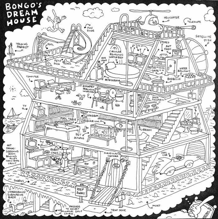
This is part one of a BBC program called ‘My Wasted Life’ about Simpsons creator Matt Groening. Groening recalls the sweet surreality of his own youth as well as the cultural roots of Bart and the gang. My favorite Groening comic: Bongo's Dream House.
Jenny Holzer: PROTECT PROTECT (Whitney Exhibit)
This video considers the politics of Jenny Holzer’s work on view in 'PROTECT PROTECT' at the Whitney Museum. Jenny Holzer has always been one of my favorites due to her skill at uniting image and word; the intersection of visual and literary arts has been a lifelong fascination for me. See the Whitney exhibit this week; its last day on view is Sunday, May 31st.
??????
Here is your new muse. Watch this video once a day and behold the wellspring of creativity that is sure to erupt from within your spirit.
Attention: Artists
Do you need to get your portfolio online or upgrade your web presence? I'd like to build your site - and at a very low price. I've been building websites for the last year (mostly Wordpress-based blog/magazine sites like the one I built at www.fivechapters.com) but I'd like to begin building portfolio sites (view the one I built for my own work at www.magneticstate.com). My goal is to build simple, professional sites with intelligent navigation and a layout that makes your work shine. Take advantage of my cheap rates while they last and drop me a line at dan@magneticstate.com.
5/24/09
Miami Baldwin & Psycho Pasta
The two most entertaining movies I watched this week were Miami Blues and Beyond the Mat.
 Full throttle Baldwin.
Take one look at the film still above and you'll understand why I had to watch Miami Blues. This is a bizarre movie that's a lot of fun to watch; the schizophrenic tone of the film wanders between dark comedy, cop thriller, and B-movie drek. This forgotten nineties flick stars the inimitable Alec Baldwin in a full-throttle performance as a con man prone to thievery and suspicious sidelong glances. In most scenes, Baldwin can be seen slugging on a beer while proudly displaying his beastly chest hair. The wafer-thin 'plot' of the movie is nonsensical and bizarre - Baldwin kills a Hari Krishna at the airport by breaking his finger (?), and spends the rest of the movie dodging the cops while posing as one. Overall fun to watch for the weird performance by young Baldwin in his prime and tacky nineties Miami Vice wardrobes.
Beyond the Mat is a documentary about pro wrestling. These real-life stories might pull a Star Trek on you by entertaining and fascinating you even if you don't normally give a shit about the subject matter. Judging by the tales in this film, Mickey Rourke's chewed-up has-been in The Wrestler probably feels almost biographical for many former pros (especially Jake 'The Snake' Roberts). The most arresting character is Mick Foley (aka Mankind), a kind and sensitive family man whose on-stage persona is a savage madman. Foley gets a dose of reality when he sees his kids' visceral, potentially traumatic reactions to the beatings that Dad takes at work. Beyond the Mat reveals that pro wrestling is "fake, but not as fake as you'd think." These guys are choreographed and trained, but they often bleed real blood and literally put their lives on the line.
5/23/09
The Appropriate Demeanor
"The appropriate demeanor for a human is to feel lucky that he is alive and to humble himself in the face of the immensity of things and have a beer." --Dr.Kary Mullis, winner of the Nobel Prize in chemistry
5/20/09
The Work of A.J. Fosik

A.J. Fosik has a show that goes up at White Walls (San Francisco) on June 13th. View more of his recent work here. A.J. and I had a few classes together at Parsons and his work has developed into something astounding. These pieces look like Carlos Castaneda acid visions of animal spirits from another realm. They also remind me of the evil puppets in Joe Dante's portion of Twilight Zone: The Movie. I am impressed with the complexity of the structure, the attention to detail (check out the veins protruding from the bottom of the head), and a sense of mythology that is just as sophisticated as the mouth-watering use of color. For those of you in the San Francisco area, I'd recommend going to see the White Walls show because I bet that up close, these things look like they are going to devour you, digest your spirit, and regurgitate it in the form of a thousand brightly colored pieces.
5/17/09
All Apologies

This amusing set of 9 mock open/closed signs comes from the clever people at Aesthetic Apparatus (go here to see the other side of the signs). Not only are these folks charmingly self-effacing and clearly having lots of fun, but everything that comes out of their studio looks like a million bucks.
Subscribe to:
Posts (Atom)

 Posts
Posts